Tag: digital
Protected: D&AD – Sculpture Development
Digital Me – Finishing Touches
Our final deadline for the Digital Me project is on Tuesday so I am just adding the final finishing touches to all of my submissions before then.
I am feeling confident with the way I am heading and I have not got a lot to do before handing in my finished work for the deadline on Tuesday. I have completed my Research and Development PDF for Persuasion and am currently finishing off the one for Penguin. I have already got a Research and Development PDF for branding that I created last year after completing the Brandworld project, so I have just got to add and change this one accordingly to my further development since then and my newer final outcomes.
For the finishing touches of my CV, online portfolio, PDF portfolio, I have edited some details to add to the overall final look of the finished pieces. After a tutorial with Neil, we spoke about how underlining titles, historically, was not considered needed after ‘bold‘ was invented. Although I have decided against using the bold version of Playfair Display as I think it ruins the beauty of the contrast between the thick and thin lines in the lettering of the typeface, I have removed the underlines of the titles and the overall look of the CV is much cleaner without them. I have done the same thing on my PDF portfolio by removing the underlines of the titles. Removing these underlines have actually added to the consistency of my overall project, because I noticed that the website does not have underlined titles. There is enough definition between the title and the body text because they are different typefaces – the title is serif and the body text is sans serif, the title is in orange and the body text is black, and there is also a big size difference between the two.
To match the removal of all my title underlines, I have edited my ‘I’m Amber‘ logo slightly as well. I have removed the underline below the text, but kept the line above as the image of me is sat, resting on it. I have adjusted the weight of the upper line to make up for it’s staying though.
Digital Me – Further Development
Since last week, I have made small developments to all three of my main pieces: the CV, the online portfolio and the PDF portfolio.
In the PDF portfolio, I have added in the text and the images to each of the project pages, although one or two are still missing that I want to add in. I have made sure that they are the same images used in my online portfolio and that the brief and solution are the same too. I have added in navigation buttons on every project so that you can flick through the projects using arrow buttons and also return back to the home page. After a tutorial, I have increased the text size by 1 or 2 points because it was suggested that it was perhaps just a little too small. At the the end of my portfolio, I have added an extra page which is a ‘Contact’ page and also has an ‘About Me’ paragraph, similar to the CV.
For the CV, I have added in work experience and also written the ‘About Me’ section. Like the PDF portfolio, I have developed my CV so that it is now interactive too. It has icons which link to my social media profiles: Twitter, Instagram and LinkedIn. I decided to exclude Facebook because my account is a personal one and I think it is important to keep my CV purely professional and not mix up my personal life with work. I have also added a link to my online portfolio so that employers looking at my CV can get to my work with one easy click.
On my online portfolio, I have gone ahead and removed the ‘Home’ page as I decided that it was not needed – my online portfolio now opens simply with the text saying, “Hello and Welcome!…“. After originally arranging the images on each of the project pages one after each other in a straight line as individual images down the page. I have now arranged them in a more designed layout (image below: I have taken a screenshot from one of the project pages as an example). I have also spread ‘The Solution’ paragraph between these images because I felt that there was too much text to begin with at the top of each project.
My next steps are to move on to beginning the Research and Development PDFs for my Subject projects: Persuasion, Penguin and Branding.
Digital Me – the PDF Portfolio
The last main piece I have to make for Digital me is the PDF portfolio, so that has been my next step to take.
I wanted to make the PDF consistent with both the CV and the online portfolio, so I created it in a similar way. I ensured that all the smaller details matched, for example the underlining of titles and the chosen fonts.
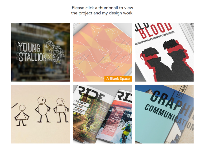
Wanting the PDF to be interactive, I created a home page with thumbnails of the six projects that I had chosen to include in my portfolio. From this home page, the user can click a project thumbnail to be taken directly to that project. Also, on hovering over a thumbnail, the image changes (as I have added a rollover image the same but with a white layer over the top with an opacity of only 50%) and the name of the project appears. The image below is a screenshot taken of the PDF portfolio home page – the ‘A Blank Space’ thumbnail shows what the hover over looks like.
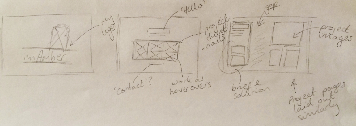
I have inserted in all the needed pages for each of the projects and given them titles accordingly. I have then created the links so that each of the thumbnails on the homepage takes the user to the correct project. I have created a rough layout for each of the pages and my next step is to start inserting my design work. I want to have a column of text down the left side, which will include the title of the project and then the brief and my solution, and then the images of the outcomes will be positioned on the right.
Digital Me – First Tutorial
Over the last few days, I have been working on developing my brand style ready for my first tutorial today.
I began with attempting to self-brand myself using my name rather than an actual logo. Finding a photograph of myself that was able to actually interactive with the ‘title’, I’m Amber, made me realise that this was the style I liked best. Unfortunately the photograph is not high quality enough for me to be happy with and I want to capture a better one, but this has at least helped me decide on a favourite style. I should be able to use I’m Amber in both ways, with and without the image of myself sat on it.
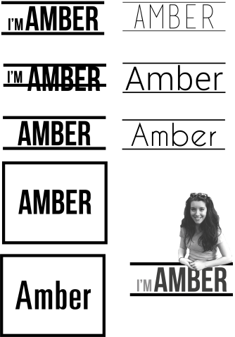
After testing out a few different fonts and style, and picking a favourite, I began experimenting with colour and of course I had to use my favourite colour orange (Pantone 144 CP) that I use in so many of my projects. After all, it is my colour, “amber”.
I have put together an initial rough CV layout that I think works well alongside my personality and overall brand. My next step is to begin creating the online portfolio layout in consistency to the CV. As my CV is not fully completed yet, I will be able to make changes accordingly if needed – I think it is necessary to keep myself flexible in the beginning ideas generation and design stages of this Digital Me project.
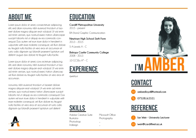
Although I had more or less decided that I would not use my pre-existing logo (used on some social media), I wanted to put it into my CV just so that I could confirm or disconfirm in my tutorial if I was choosing the right way to go. Sure enough, my logo was pointed out as being probably unnecessary, so I am going to go ahead and remove it. Although the logo is not needed, they agreed that it was a great touch to have an image of myself interacting with the title, I’m Amber, as a personal touch. In my tutorial, it was picked up on by my peers that the use of the key colour orange worked really effectively as it doubled up well as being the colour “amber”, just like I am, Amber. The typefaces that I have chosen are Bebas Neue for the headlines and Champagne & Limousines for the body text.
Digital Me – Branding Myself
One of the hardest parts of beginning the process of this Digital Me project is branding myself. It is certainly much harder to brand yourself than it is to brand a client.
There are lots of things to consider when branding yourself – trying to ask yourself, “Who am I?” is a lot harder than I first anticipated. The first obstacle I have come across is whether to have a logo or not? I had previously created myself a logo to use on my social media (e.g. Instagram), but was unsure as to whether I should carry this through to use in this project or leave it behind.
![]()
After speaking to the lecturers in university, they recommended not to use a logo and to sell yourself as a name instead. Why not a logo?
What does a logo mean? A logo represents years of commitment, hard work, reliability, trustworthiness – it is a promise of professional skills. As a student designer, I do not have these years of experience under my belt yet so I would not want to risk a negative response of my logo from, let’s say, a director of a well-established design company, who has built their own business over many years and has worked hard to develop relationships with people who are now their clients – they have established a clear identity, a well-trusted, competent brand, and this is all shown through their logo. It is important for me to consider how you might respond to a newly-graduated student’s logo in order to make me realise that perhaps not having a logo was the best way to go for self-branding.
What is a logo representing? How might I want to reveal myself through using graphic language to include my human-scale skills, personality, ancestry, culture, interests, motives, awareness of graphic design? And how might I contextualise this graphic representation sensitively, perhaps discreetly into your house-style? This could potentially be quite difficult to show through a logo at this stage, and I certainly do not want to create something that simply isn’t very good. “If [it] is… terrible, I’ll instantly be put-off. Better to keep it simple… If [it’s] a great idea, it needs to be really great.” Mark Smith, branding specialist. This leads me agree that a logo is not needed and that my own name would be the best way to brand myself for now.
Things to consider when branding myself:
- Simplicity and clarity – have a single focus and don’t make it confusing.
- House-style and consistency – apply a well-developed visual consistency throughout all pieces (PDF, online and CV).
- Photography – use high quality images only.
Digital Stitch
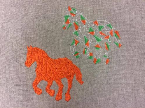
Today I found the time to go in and finally complete my design that I created a few weeks ago but didn’t have the time to actually stitch it out.
I love how this one has turned out, although I think the simplest design would work best for the branding. However, saying this it was still good fun and interesting to experiment with the range of motif fills that were available. I used various fills that were made up of triangles. I tried to think about where I was using each pattern, for example the filled in one which looks darker because it a block-colour, I used on the back leg which would be in shadow. I used the same block-colour fill to separate the horse’s mane, tail and hooves.


I am interested in using textile techniques where I can in my further projects. I am thinking perhaps I could digital stitch into paper if the opportunity arises and fits relevantly with what I am doing or creating.
Digital Stitch Workshop – Week 3
This week in the digital stitch workshop, I worked more on my Young Stallion logo, this time being a bit more experimental with it.
Last week I used the smaller digital stitch machines but this week I used the really big one. It was crazy – it was almost twice as fast to stitch as the smaller machines are, and you can fit up to ten cotton reels on it at once, so you can use multiple colours without having to stop the machine and change them by hand like you need to do on the smaller machines – once you have programmed it to, the machine will change colour automatically. As well as changing colour on its own, it also cuts the thread in between different stitches on it’s own too. So for example, on my orange and green version of the logo, when the needle moved from triangle to triangle, it cut the thread before doing so meaning it not leave messy leftover lives behind when finished which I would have had to trim off by hand. However, although the machine is capable of this and I did use it for this particular horse, I turned off the ‘thread cutting’ option when it was stitching the block orange one, because it was a lengthy pattern to stitch out and by turning off the ‘cutting’ option, it chopped the time in half. This meant that for the orange horse only, I had to very carefully trim the ‘uncut threads’ off of the finished piece.

Drawing the design on computer

The machine in process

Drawing the design on computer

The machine in process

The machine in process

The machine in process

The machine in process

The machine in process
The orange horse, although it is only one colour, you can still make out the difference between the individually stitched triangles. This is because I have changed the angle of the stitches so that they are facing different directions to each other – this makes different triangles catch the light differently. I have not needed to do this on the green and orange horse as the colours are different. Both of these horse designs that I did today were much smaller than last week’s design as I wanted to fit more into one design. However, doing this has affected the quality – being so small, the triangles are less distinguishable, especially on the orange one which I feel would work much better if it was the size. If I were to use a ‘filled in’ version of the logo like this on the Young Stallion products, I would need to enlarge the design slightly – for this reason, I feel that an ‘outline’ style of the logo will be more suitable. I want to experiment with a few more outline ideas to narrow done my research and ideas further.
I have created a design using motif fills and embossed fill on the digital stitch computer software which I did not get the time to stitch out today. I plan on going back at some point hopefully this week to get this one stitched out.
Digital Stitch Workshop – Week 1 & 2
Today was my second week of the digital stitch workshop that I signed up for and have been doing.
What is digital stitch?
Digital stitch is simply the embroidery of a digital era.
During last week’s workshop, we were introduced to the software used to design for the digital embroidery machines. The software is an extremely versatile piece of software, and can be used for a wide variety of outcomes, including logo design, placement and repeat designs, and hand drawn images created in stitch. It is therefore suitable for students from all courses.
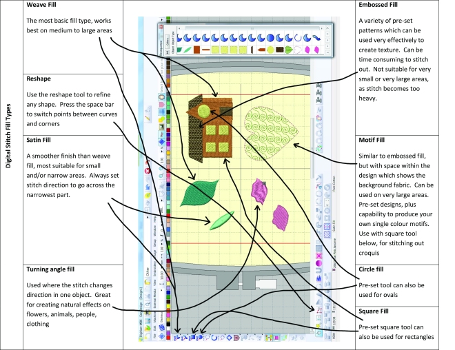
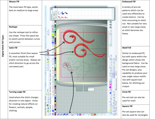
Last week’s workshop covered all the basic tools needed to create a successful embroidery design, so this week we were able to get straight into doing our own designs. Today we worked from our own designs or artwork. We used the techniques and skills that we learnt in week one, as the basis for further advanced techniques that we used today. We were then able to stitch out our finished pieces on the embroidery machines.
I wanted to create something that would benefit the work that I am doing in my own subject. I decided that I would do something that could go towards my branding project that I had previously worked on. I took in, via USB, a pre-prepared image of my geometric horse that is part of my Young Stallion logo – this horse was also to be used as an embossed or stitched trademark on some of Young Stallion’s products, for example, saddles, horse jackets, riding clothes, etc. On the digital embroidery software, I drew the outline of the geometric horse ready to be stitched out on the machines.

The finished stitched piece

Drawing the outline on the computer

The machine in process

The machine in process

The machine in process

The machine in process

The machine in process
Next week, I hope to continue to use the same Young Stallion logo but stitch it out in different ways. For example, I will compare using the normal weave stitch to the satin stitch – I can play with maybe filling in some triangles and try out some new colours as well.
